
On how a Myeongdong flagship borrowed the codes of hospitality to anticipate a world in which beauty brands compete through environments, rituals, identity and place as much as through products
A store sells you a thing. A world asks you to stay.
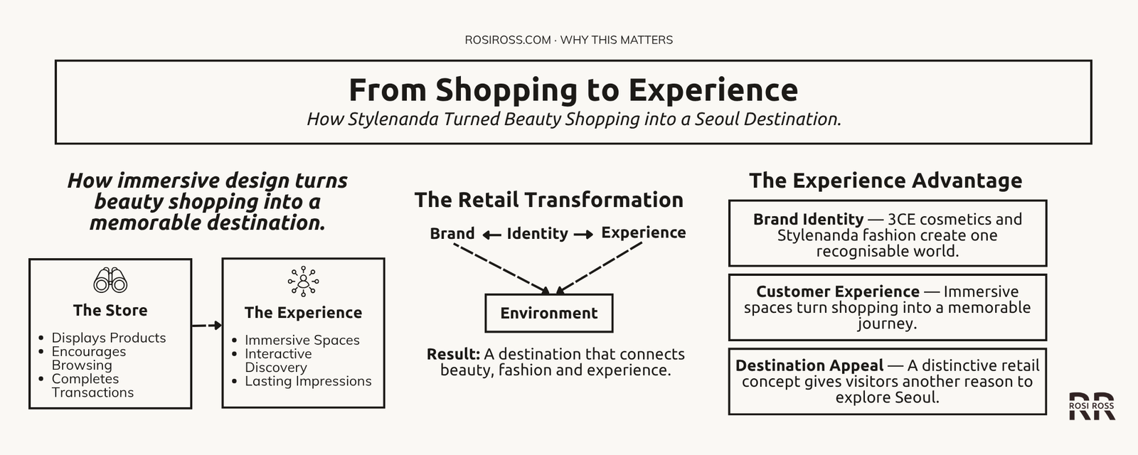
Stylenanda Pink Hotel mattered because it anticipated a world in which beauty brands would compete not only through products, but through environments, rituals, identity and place. It was a store designed not merely for shopping, but for entering a complete beauty world, and the more interesting question is not why it was pink. It is why a cosmetics-and-fashion company chose the language of a hotel at all.
The question that gives the Pink Hotel its lasting interest is a larger one: how did Korean beauty become something people wanted to travel into, not simply buy? The answer lies less in any single store than in the ecosystem around it, a Seoul in which beauty, fashion, food, entertainment, digital culture and retail experimentation continuously informed one another. The Pink Hotel is a physical example of that ecosystem thinking, and it is best read as a reference point in the evolution of immersive beauty retail, not as a recommendation or a review.
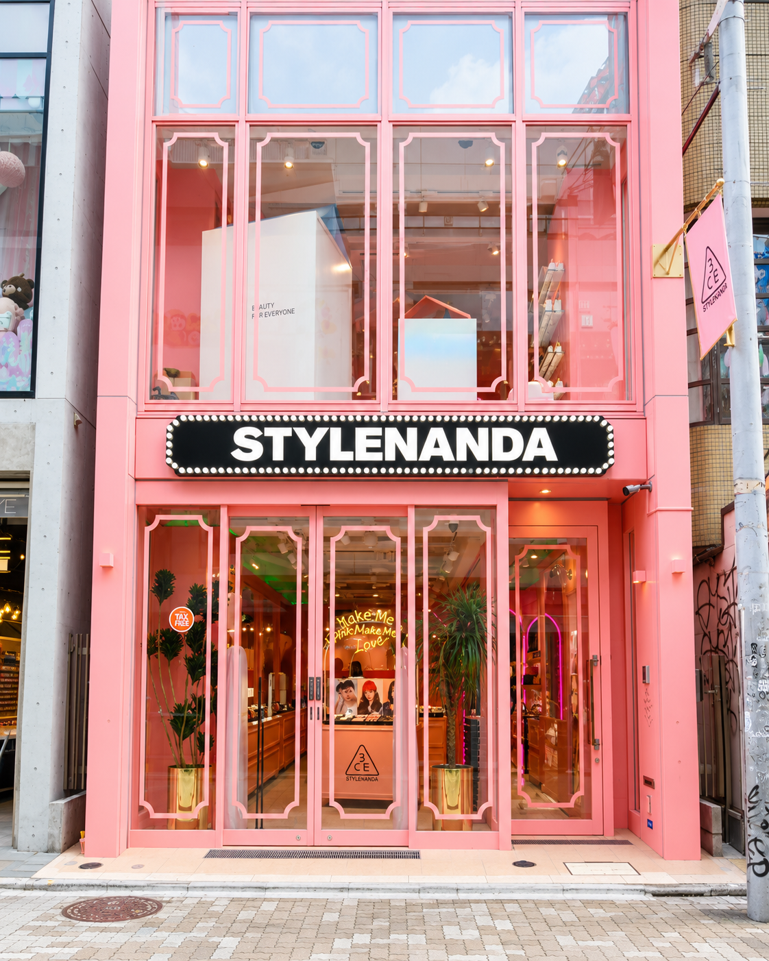
What is Stylenanda Pink Hotel in Seoul? Stylenanda Pink Hotel is a hotel-themed flagship in Seoul’s Myeongdong district, opened by the Korean fashion and cosmetics company Stylenanda in 2016. It is not a hotel. It is a retail environment that organised 3CE cosmetics and Stylenanda fashion across floors styled as a lobby, spa, rooms and laundry, with a pool-themed cafe and rooftop above. It has since been redesigned as the 3CE Pink Space Hotel.
Before Beauty Retail Became an Experience Economy
The product was the destination, and the environment was neutral.
Mass beauty retail for much of the twentieth century was organised around the counter: a fixture, an assistant, a display and a transaction. By the middle of the 2010s that logic had begun to strain, as e-commerce made the transaction convenient and physical stores had to justify the journey. Stylenanda’s Myeongdong flagship, opened in autumn 2016 as the company’s third flagship, was an early and vivid answer to the question physical retail now has to ask itself: what can a store offer that a screen cannot?
The answer was a setting, and the idea has a long lineage. The nineteenth-century department store already treated shopping as spectacle, and Émile Zola’s novel The Ladies’ Paradise, published in 1883, took that world of display, abundance and desire as its subject. In 1998, B. Joseph Pine II and James H. Gilmore argued in the Harvard Business Review that economies move from selling commodities to goods to services and, finally, to staged experiences. What the Pink Hotel added was not the principle but its application to a cosmetics counter, in a city whose retail culture was unusually ready for it. Market research on luxury consumers has pointed in the same direction, framing experiences as a serious competitor to goods and emotional connection as a driver of desirability. That research concerns luxury clients and not mass beauty, and should be read as adjacent evidence, but the direction is the one the Pink Hotel took early: toward meaning, memory and participation.
Why Stylenanda Built a Hotel Instead of a Store
The checkout counter became a check-in desk.
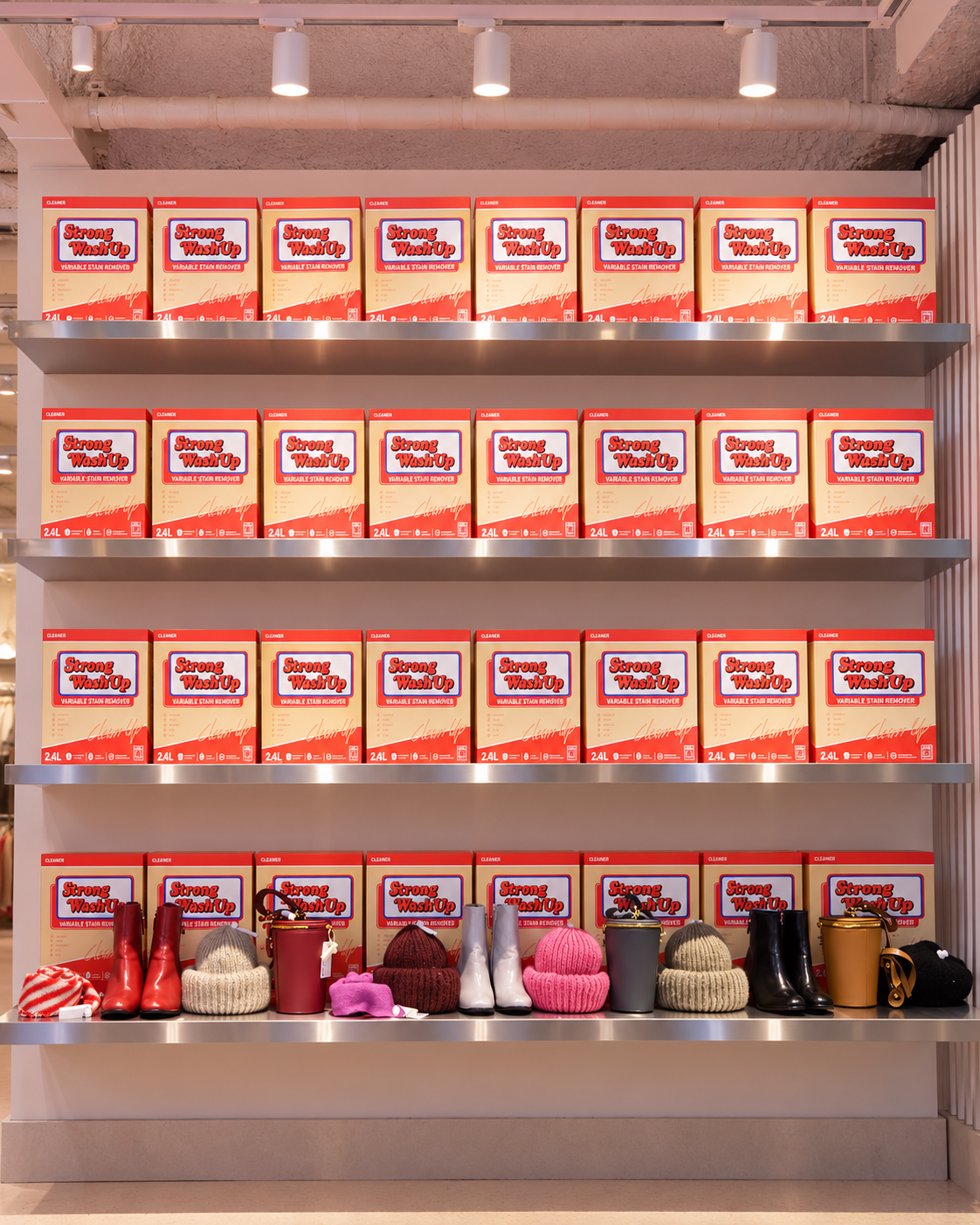
A hotel is the most legible container of leisure. Everyone understands its grammar: arrival, reception, rooms, services, a pool, a rooftop, a sense of being temporarily looked after. By borrowing it, a retailer could organise a very ordinary activity, buying cosmetics and clothes, into a sequence of places and moods. Floors became rooms. The result was a narrative structure that customers could understand instantly and move through intuitively.
That choice reveals something about Korean consumer culture, which blurred shopping, leisure and tourism long before experiential retail became a global industry phrase. It should not be mistaken for a claim that Korea is inherently more imaginative. The stronger argument is contextual. A dense, young, highly connected city with fierce retail competition rewards the brand that can turn a store into a reason to visit, and Stylenanda had the advantage of being a fashion house first.
What is the relationship between Stylenanda and 3CE? 3CE is the cosmetics brand of Stylenanda’s parent company, Nanda Co. Stylenanda began as a fashion business and increasingly became led by 3CE, which by 2018 represented more than 70 percent of the company’s business. L’Oréal acquired 100 percent of Nanda Co. that year, and the Pink Hotel brought both brands under one roof.
3CE and the Power of a Complete Beauty World
Make-up is play, trial and reinvention more than correction.
The word that matters in Stylenanda’s history is “lifestyle”. L’Oréal’s announcement described Nanda as a Korean lifestyle make-up and fashion company, and that framing explains the flagship. A conventional cosmetics brand invites a customer to buy a lipstick. A fashion-born brand invites a customer into a look, and colour cosmetics are where that invitation is easiest to accept.
This is where beauty intelligence belongs. Why does the environment around a product change desire? Because trial is a performance, and a performance needs a stage. At the Pink Hotel, the second-floor spa gave testing a theatrical frame, with vanity-style basins, gold-framed mirrors and, in the original design, a bathtub of petals, and visitors described fitting rooms styled like shower stalls. Mirrors, lighting, colour and circulation shape how make-up feels to try: whether it is clinical or playful, solitary or shared. None of this makes a product perform better. Sensory experience and efficacy are different things, and a rigorous reading keeps them apart. What the environment changes is the willingness to experiment, which is a different and no less commercial asset. The same reasoning applies to beauty traditions built around ritual, where the setting is part of the practice.





How the Pink Hotel Turned Shopping Into an Itinerary
Retail that has a beginning, middle and end behaves like an itinerary, and itineraries are what travellers remember.
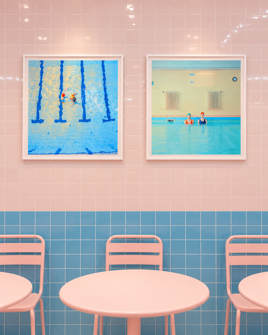
In its original configuration the building worked as a vertical journey. Visitors entered a ground-floor lobby devoted to 3CE, where a bed was suspended from the ceiling and the checkout resembled reception. The spa floor continued the cosmetics. Above it, rooms and a laundry presented the fashion line, in settings that included room-numbered doors, velvet carpet and washing machines with places to sit. At the top, a pool-themed cafe and a rooftop terrace offered a pause from the district below. Time Out Seoul observed that, on the top floor, the noise of the surrounding streets seemed far away: a store that sold escape inside one of the busiest retail districts in Seoul.
The sequence mattered more than any single floor. Each level changed the register of the visit, from arrival to trial to rest, and the customer moved through a story and not a stockroom.
What makes a beauty store a travel destination? A beauty store becomes a destination when it offers something a visit alone cannot be replaced by a purchase online: a coherent world, a sequence of spaces, opportunities to participate rather than only buy, and a sense of place that visitors associate with the city itself. Stylenanda Pink Hotel did this by borrowing the structure of a hotel to organise cosmetics, fashion, a cafe and a rooftop.
The Business Behind the Fantasy
A flagship can be a store and a medium at once.
The environment was not decoration for its own sake. L’Oréal’s May 2018 announcement gives the numbers: Nanda Co. had been founded by Kim So-Hee in Seoul in 2004, 3CE represented more than 70 percent of its business, turnover reached 127 million euros in 2017, and the company employed nearly 400 people across Korea, Japan and several Asian markets. The release named the Myeongdong Pink Hotel and Pink Pool among the flagships where fans could fully live the consumer and brand experience. L’Oréal’s own executive described the brand as one that captures Seoul’s vibe, edge and creativity. These are figures from a particular year and are cited as history, not as a current measure of the business.
Who founded Stylenanda, and when did L’Oréal acquire it? Stylenanda was founded by Kim So-Hee in Seoul in 2004. L’Oréal announced the acquisition of 100 percent of its parent company, Nanda Co., on 2 May 2018. At the time, 3CE accounted for more than 70 percent of the business, and the company reported turnover of 127 million euros in 2017 with nearly 400 employees.
The company also sold through e-commerce, specialist retailers, department stores and duty free, according to trade coverage of the acquisition, so the Pink Hotel did not need to be the only place a customer met the brand. It needed to give the brand a place to be remembered. That is a different commercial role from a shop, and it is the one that explains why a fashion-and-colour company would invest in architecture.


When Beauty Retail Became Tourism
The culturally curious traveller learns as much from the way a place sells cosmetics as from its museums.
Myeongdong and Seoul are more than backdrops. Beauty shopping reveals how a city understands youth, aspiration, social behaviour, design and leisure. A museum shows what a culture chose to preserve; a beauty street shows what it is currently inventing, who it is inventing it for, and how it expects them to behave once they arrive. The traveller who walks a district built around cosmetics is reading a living document: the pace of the pavement, the way staff address strangers, the amount of play permitted in trying something on, the assumption that looking after one’s appearance is a form of leisure and not a chore.
Travel has always included shopping, and the shops visitors remember are rarely the ones that were merely convenient. The covered arcades of nineteenth-century Paris, the bazaars of Istanbul and Marrakech and the department stores of London and New York were destinations in their own right, places a visitor was sent to see before they were ever asked to buy. The Pink Hotel belongs to that lineage in a contemporary register. It sat at the intersection of four things at once: a fashion-led brand, a young audience, a district built for walking and browsing, and a visual identity legible to people who could not read Korean. That last condition is the quiet key to its reach. A world that can be understood at a glance, without language, travels further than one that needs explaining.
The word that gets attached to such places, often dismissively, is photogenic. It deserves a more careful treatment. Photography was part of the logic: a consistent environment is easy to recognise and remember, and recognition spreads. A visitor who photographs a space is also, in effect, taking a note, fixing the memory and carrying it home in a form that can be shared. But a store designed purely for pictures is a set, and a set is what manufactured environments tend to become. Its visitors arrive for the photograph, leave once they have it, and have nothing to remember beyond the frame. The Pink Hotel’s durable interest lies in the fact that its images were a consequence of a coherent idea, not a substitute for one. The picture was the by-product of a place with a sequence, a mood and a point of view, and the test of any such space is whether it still means something when the camera is put away.
There is a lesson here for the traveller as much as for the brand. A place that sells beauty well is telling you what it values, and the intelligent response is to look at the whole setting, not only at the product: the choreography of the floors, the way trial is encouraged, the line between spectacle and substance. Visited in that spirit, a cosmetics flagship becomes a short lesson in a city’s character, and a good reason to cross it.
Pink as Brand Architecture
Pink here is not inherently feminine, juvenile or superficial. It is a branding technology, in the way a typeface or a logo is.
Colour should be taken seriously, and without assumptions. The instinct to read pink as a statement about gender, age or frivolity mistakes a cultural habit for a design fact. In a brand system, a colour is a tool: it tells the eye where it is, who it is dealing with and what to expect next. A controlled palette creates instant identification, continuity between packaging and environment, photographic consistency, memory, and the sense of entering a complete world. When a lipstick, a facade and a rooftop share one colour logic, the customer experiences the brand as a place, and places are easier to remember than products.
The strategy is not new, and the strongest examples show why it lasts. Tiffany’s robin’s-egg blue has long functioned as a signature that a customer recognises before reading a single word, and Hermès is commonly associated with the orange of its boxes and packaging. In each case the colour does the work of a name: it is applied consistently, over a very long period, to objects, packaging and spaces, until it carries the meaning of the house itself. The lesson is discipline. A colour becomes an asset only when it is repeated, protected and not diluted, and a flagship is the place where that repetition can be total, with no competing signal to dilute it.
The research on colour deserves the same care. Psychologists who study colour and behaviour caution that its effects depend heavily on context, culture and the object it is attached to, and that popular claims about what a given hue “does” to people are often overstated. A review by Andrew Elliot and Markus Maier in the Annual Review of Psychology makes the point that colour can carry meaning and influence perception, while stressing that the evidence is still developing and context-bound. That is a useful discipline for reading the Pink Hotel: its pink did not work because pink is universally persuasive, but because it was applied with such consistency that it became the brand’s own.
That is a genderless proposition. The same principle governs any strong sensory identity, as with fragrance houses that build a recognisable world around scent: a consistent signal, repeated across surfaces, becomes memory. Scent, colour, sound and texture are all channels for the same strategy, and the most coherent brands use several at once so that no single element has to carry the whole identity. The question worth asking of any such world is not whether the colour is fashionable, but whether it is held steadily enough, for long enough, to belong to the brand and to no one else.
What Seoul Understood About Physical Retail
Seoul treated the store as an interface between a brand and a city.
The scale of what that city produces helps explain why. South Korea has become one of the world’s leading cosmetics exporters, with skincare accounting for the largest share of its beauty exports and colour cosmetics a smaller one, a useful reminder that the Pink Hotel’s world belonged to the colour-and-fashion corner of K-beauty and not to its largest export category. Export rankings and shares shift from year to year and should be checked against the latest figures from South Korea’s Ministry of Food and Drug Safety or a current trade report before reuse. The Pink Hotel is a lens on the system, not a summary of it.
Why is Seoul important to K-beauty retail? Seoul combines a dense, young and highly connected consumer base with an ecosystem in which beauty, fashion, food, entertainment and digital culture continuously influence one another. That environment rewards retail experimentation, and flagships such as Stylenanda’s Myeongdong Pink Hotel became early examples of beauty stores designed as destinations. South Korea has become one of the world’s leading cosmetics exporters.
The Global Lesson of Korean Beauty World-Building
From customer to temporary inhabitant of the brand.
It would be inaccurate to claim that every experiential store was copied from Korea. The Pink Hotel is better understood as an early, vivid example of a broader shift that later became common across global beauty and luxury retail. The shift has five movements. From counter to environment. From transaction to participation. From product display to world-building. From retail address to destination. From customer to temporary inhabitant of the brand.
The same reasoning appears wherever brands compete on place, whether in the new geography of experiential dining or in the retail theatre of luxury commerce. What differs is the vocabulary. What persists is the underlying belief that people value participation as much as possession.
How did Korean beauty brands change retail experiences? Korean beauty and fashion brands, including Stylenanda and 3CE, helped popularise the idea that a store can be a themed world and a destination, with immersive design, playful trial and visual identity as part of the offer. The shift from counter to environment later became common across global beauty and luxury retail, though it developed in many places at once.
Why the Pink Hotel Still Matters
The idea outlived the set. A destination that can be repainted without losing its identity is not a trend. It is a brand asset.
The building itself has changed. The Myeongdong flagship was later reinterpreted by the design studio xsxl as the 3CE Pink Space Hotel, which Designboom described as a futuristic twist on the original, with reception, art deco details and a spaceship-like fantasy. Korean design press reported that the aim was to keep the brand’s existing image assets while adding contemporary novelty, and to extend the existing world and not replace it.
The Pink Hotel’s continuing relevance comes from the questions it raised. What can physical retail offer that e-commerce cannot? When does a store become a destination? How can beauty brands create cultural memory? Why do consumers value participation as much as possession? How does a local brand aesthetic become globally legible? In an economy where attention is easy to buy, memory is what has to be built, and the Pink Hotel built it in plaster, velvet and a single colour.
Service note: check before you go. This is a historical and cultural analysis, not an opening-hours guide. The Myeongdong flagship has been redesigned since its original concept, and floor uses, tenants, cafe operations and hours change. Confirm the current store, address and opening details with the brand or an official Seoul tourism source close to your visit.
The story is not that there was a cute pink store in Seoul. It is that one flagship anticipated the future of beauty retail by turning cosmetics, fashion, hospitality codes and spatial design into a destination people wanted to inhabit. Its significance was not simply its colour palette. It was the strategic idea beneath it: that beauty could be experienced as place, culture and memory.
“A store sells you a thing.
A world asks you to stay.
Somewhere between the lobby and the rooftop
a lipstick became a reason to cross a city,
and a colour became an address.
The most memorable beauty spaces
do not simply sell products.
They give people a world to enter —
and the world,
long after it is repainted,
is what they remember.”

