
On why the Tiffany Blue Box is not packaging but a cultural encoding system, how a single colour achieved the rarest achievement in commercial branding by becoming proprietary in human perception, what Breakfast at Tiffany’s did to a jeweller’s storefront that no advertising campaign could have replicated, why the Blue Box Café is one of the most commercially sophisticated moves in the history of luxury retail, and what Tiffany’s most durable asset teaches every luxury brand about the economics of recognition
There is a specific shade of blue — robin’s egg, Pantone 1837, trademarked and unmistakable — that the human eye can process as a brand signal before the brain has consciously registered a product, a logo, or a name. This is not a trivial achievement. It represents one of the rarest and most commercially durable things that luxury can produce: a visual reflex. Not recognition in the sense of reading a label or identifying a font. Recognition in the more primitive and more powerful sense of a physical response to colour — the way a certain red triggers certain associations, the way a certain orange triggers others, and the way this particular blue, on this particular box, with this particular ribbon, has been triggering the same associations in human perception since 1878, when Charles Tiffany first adopted it as the house colour of what would become the world’s most recognisable jeweller.
The Tiffany Blue Box is the subject of this editorial but not its limit. The box is the case study. The subject is larger: how a luxury brand transforms a physical object — something that could be discarded without a second thought, as packaging by definition exists to be discarded — into a cultural signal of such precision and such durability that it outlasts virtually every other brand communication the company has ever produced. The box does not contain jewellery. The box contains meaning. And unpacking what that meaning is, how it was accumulated, and why it remains potent in an era that should theoretically have diluted it is one of the more interesting exercises that the contemporary luxury economy makes available.
The box — how packaging became the primary luxury product
Charles Lewis Tiffany founded Tiffany & Co. in 1837 as a stationery and fancy goods shop on Broadway in New York, with his business partner John B. Young. The early company sold a wide variety of goods. The colour blue appeared in the house’s identity from the 1840s — its precise origin within Tiffany’s visual history is the subject of varying accounts, but its consistent application to the signature box has been dated to 1878, the year that Tiffany issued its first Blue Book catalogue, which used the colour on its cover. Whether the choice was influenced by the fashionability of turquoise in Victorian jewellery, by the association of blue with trust and fidelity in the broader culture of the period, or by some more pragmatic determination by the house’s early leadership is less important than what happened next: the colour was applied consistently, generation after generation, until consistency itself transformed it into a code.
The specific shade — Pantone 1837, the number referencing the year of the company’s founding — has been a registered trademark in the United States since 1998. This is legally significant but commercially secondary: Tiffany Blue had operated as a de facto proprietary colour in consumer perception for decades before any trademark filing acknowledged what the culture had already accepted. The trademark formalises an achievement that was already complete. The more interesting question is how that achievement was reached — how a colour that belonged, in the natural world, to robin’s eggs and certain turquoise stones, became in the commercial world inseparable from a single brand. The answer involves one principle applied across one hundred and fifty years with a consistency that virtually no other luxury house has managed in any visual domain: the box was always this blue, the ribbon was always white, and nothing — no seasonal campaign, no designer collaboration, no corporate ownership change — was allowed to alter either. The most durable luxury codes are always those whose value accumulates through repetition across time rather than through novelty across campaigns — and Tiffany Blue’s century-and-a-half of consistent application is the most complete available example of this principle in the luxury goods sector.


Tiffany Blue is the proprietary colour of Tiffany & Co., registered as Pantone 1837 (the number referencing the year of the company’s founding in 1837). The colour has been associated with the Tiffany Blue Box since at least 1878, when it appeared on the cover of Tiffany’s first Blue Book catalogue, and has been consistently applied to the company’s signature packaging — the robin’s egg blue box with white satin ribbon — across more than a century and a half of continuous use. Tiffany Blue was registered as a trademark in the United States in 1998. The colour is not reproducible by competitors in commercial contexts in the jurisdictions where the trademark applies — making it one of the few colours in any commercial category to achieve the legal status of a proprietary visual asset. Its cultural recognition precedes and exceeds its legal protection: consumer research consistently demonstrates that Tiffany Blue is among the most instantly identifiable brand colours in the world, recognised by consumers who have never purchased a Tiffany product and in markets where Tiffany operates no physical presence. Tiffany & Co. was acquired by LVMH Moët Hennessy Louis Vuitton in January 2021 for approximately $15.8 billion, the largest acquisition in the history of the luxury goods sector at the time of completion.
The colour — the rarest achievement in commercial branding
The ability of a colour to function as a brand signal without accompanying text, logo, or product is among the most commercially valuable and most difficult achievements available to a luxury house — and it has been accomplished by very few. Christian Louboutin’s red lacquer sole. Hermès’ particular shade of orange. Burberry’s tan, black, red, and white plaid. These are the shortlist of colours and colour combinations that can trigger brand identification in consumer perception without any other identifying information. Tiffany Blue is on this shortlist, and it is the oldest entry on it: no other commercial colour in the luxury sector has been maintained with equivalent consistency across an equivalent span of time.
The psychology of this achievement is as interesting as its commercial mechanics. Colour operates in human perception through associations that are partly cultural (blue’s associations with trust, fidelity, and calm in the European and American cultural tradition), partly experiential (the specific memories and emotions that an individual associates with a particular shade), and partly conditioned through repetition (the same shade seen consistently in the same commercial context eventually produces automatic brand recognition). Tiffany has operated all three levers simultaneously across its entire commercial history: the colour was chosen at a moment when blue carried specific positive cultural associations; it was applied to boxes that arrived in contexts — engagements, weddings, anniversaries, birthdays — that created powerfully positive emotional memories; and it was repeated with a consistency so absolute that the conditioning effect has been achieved across multiple generations of consumers. The result is a colour that, for a significant proportion of the global population, does not simply mean “Tiffany.” It means what Tiffany means — which is a considerably more significant achievement. The most enduring design codes are always those that carry emotional weight beyond their formal properties — and Tiffany Blue carries more accumulated emotional weight than any other colour in the commercial luxury world.
Breakfast at Tiffany’s — when fiction becomes brand mythology
In the opening sequence of Blake Edwards’ 1961 film Breakfast at Tiffany’s, Audrey Hepburn as Holly Golightly steps out of a New York taxi at dawn in a black Givenchy gown, long gloves, and oversized sunglasses, walks to the Fifth Avenue window of Tiffany & Co., and stands eating a croissant and drinking coffee while studying the jewellery display. The sequence lasts less than two minutes. It is entirely without dialogue. And it achieved something that no advertising campaign in Tiffany’s history has matched: it embedded the brand permanently in the mythology of a specific version of New York femininity, aspiration, and style that has not diminished in its cultural potency across more than six decades of subsequent cultural production.
The relationship between Tiffany and the film is a case study in what might be called cultural amplification — the process by which a commercial entity becomes attached to a cultural narrative of sufficient power that the two become mutually reinforcing. Tiffany did not commission the film. It did not pay for the placement. It was simply already present on Fifth Avenue when the film’s creative team needed a setting for a sequence about aspiration and style in New York — and the choice to use it created a brand association worth more, in cumulative commercial terms, than any amount of conventional advertising spend could have produced. Holly Golightly’s breakfast at Tiffany’s transformed the store’s Fifth Avenue windows from a retail display into a stage — and the stage has never quite been struck. Every generation that discovers the film discovers Tiffany through it, not as a jeweller primarily but as a feeling: the specific quality of New York aspiration that the dawn sequence captures, in which a window full of beautiful things glimpsed through glass represents everything one wants and is not yet within reach. That is an extraordinarily potent emotional position for a luxury brand to occupy — and Tiffany has occupied it, through no direct commercial action of its own, for as long as the film has been watched. The most consequential acts of brand building in luxury are rarely those the brand planned — they are those the culture chose to perform on the brand’s behalf.
Breakfast at Tiffany’s (1961, directed by Blake Edwards, based on the 1958 novella by Truman Capote) opens with a sequence in which Audrey Hepburn, as Holly Golightly, stands at the Fifth Avenue window of Tiffany & Co. eating breakfast. The film was not a Tiffany-commissioned production; the store’s Fifth Avenue location was used as a setting that both the source novel and the film’s creative team associated with New York aspiration and luxury longing. Its commercial consequence for Tiffany has been the creation of one of the most durable brand associations in film history: the store, the windows, the blue boxes visible in the display, and the specific emotional register of the opening sequence have remained culturally active reference points for Tiffany across every subsequent generation of film audiences globally. The association functions through what brand strategists describe as earned cultural positioning — a brand identity reinforced not through paid communication but through a culture’s repeated citation of a fictional moment as representative of something real. The Audrey Hepburn version of Tiffany aspiration has been reproduced in fashion photography, interior design references, wedding aesthetics, and consumer brand positioning across six decades — each repetition adding another layer to the brand’s emotional capital without any direct expenditure by Tiffany itself.
The ritual — why the opening of the box is part of the luxury product
A Tiffany purchase involves at least two products. The first is the object inside the box. The second is the experience of receiving, presenting, and opening the box itself — and for a significant proportion of Tiffany’s most commercially significant transactions, the second product is as important as the first. The engagement ring presented in a Tiffany Blue Box carries the box’s accumulated cultural meaning into the moment of the proposal. The wedding gift in a Tiffany Blue Box communicates its own significance through the box before the recipient has seen its contents. The birthday gift, the anniversary present, the graduation jewellery — each of these transactions is shaped by the box in a way that the company understood early and has never been tempted to simplify.
This is the specific commercial achievement that distinguishes Tiffany’s packaging strategy from that of virtually any other luxury brand: the box has become a co-equal participant in the transaction rather than a disposal item. Tiffany Blue Boxes are kept. They are displayed on dressing tables and in jewellery drawers. They appear in social photographs taken not of the jewellery but of the box itself. They are reproduced as ceramic objects, as prints, as decorative items, in the company’s own home and accessories collections. The box has achieved the cultural status of an object worth possessing independently of what it contained — which means that Tiffany has been producing two desirable objects in every transaction rather than one. The sequence of moments this creates — recognition of the box, anticipation of its contents, the ceremony of the opening, the revelation of the object, the retention of the box — is a brand experience of remarkable sophistication, delivered through what is, in material terms, nothing more than a small cardboard container covered in a specific shade of paint. The most enduring beauty and luxury rituals are always those in which the form of the experience carries as much meaning as its content — and the Tiffany Blue Box ritual is one of the most precisely calibrated available examples of this in the commercial luxury world.



| The Tiffany Brand Journey — From Object to Cultural World | |
| The Object | The jewellery itself — craftsmanship, silver, diamonds, the specific Tiffany design vocabulary established by Louis Comfort Tiffany |
| The Code | Tiffany Blue — a colour applied with such consistency across such duration that it achieved proprietary status in consumer perception before trademark law confirmed it |
| The Mythology | Breakfast at Tiffany’s — a cultural association earned rather than purchased, embedding the brand in a specific emotional register of aspiration and New York femininity for six decades |
| The Ritual | The Blue Box — a packaging object that became a co-equal luxury product through consistent application and the emotional contexts in which it arrived |
| The Experience | The Blue Box Café — Holly Golightly’s fantasy given a physical address; the brand world made inhabitable at any price point |
| The Ecosystem | Home, accessories, fragrance, watches, stationery, hospitality — the expansion from a jeweller into a world, held together by the coherence of the visual code |
The Blue Box Café — turning a cinematic fantasy into a physical address
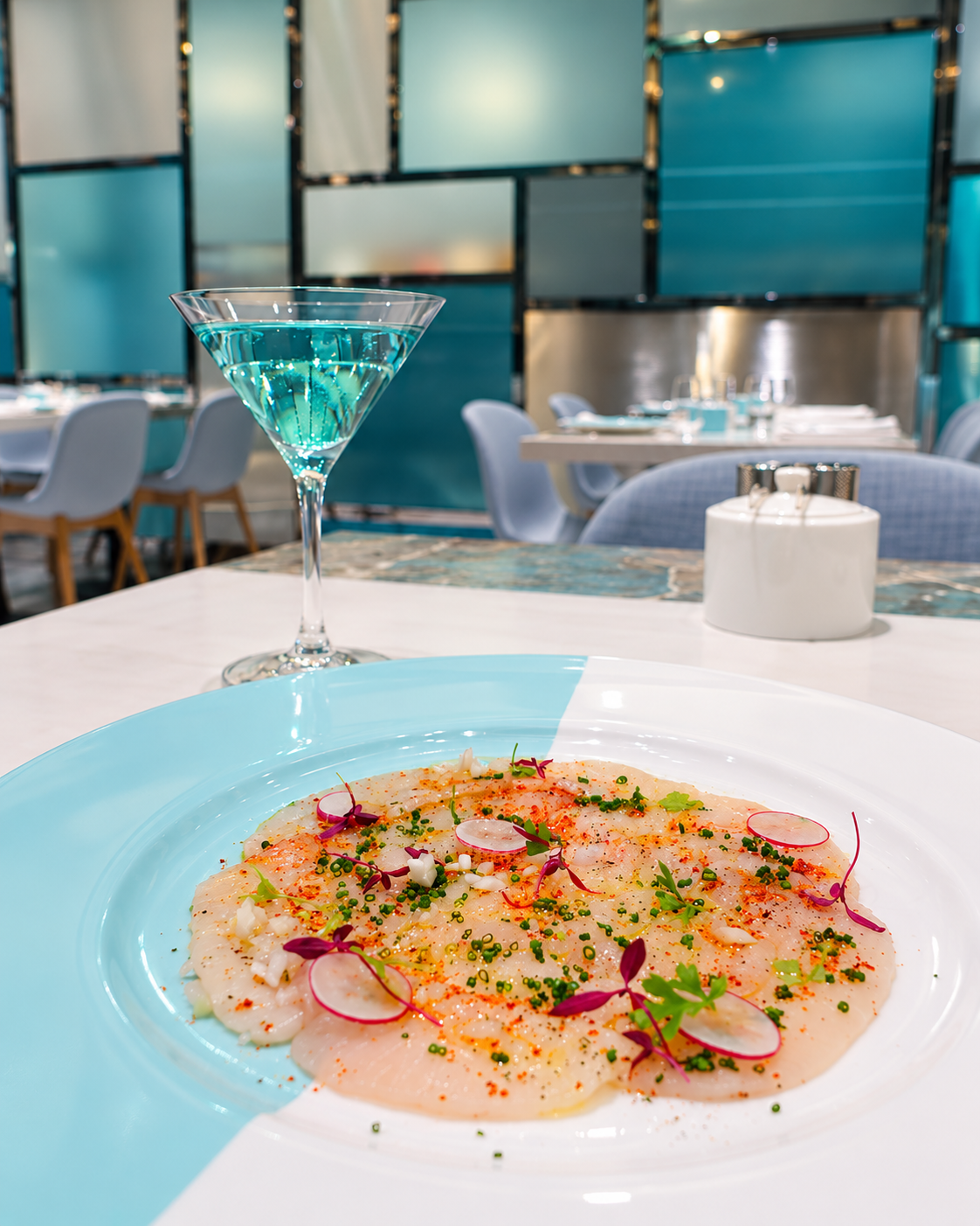
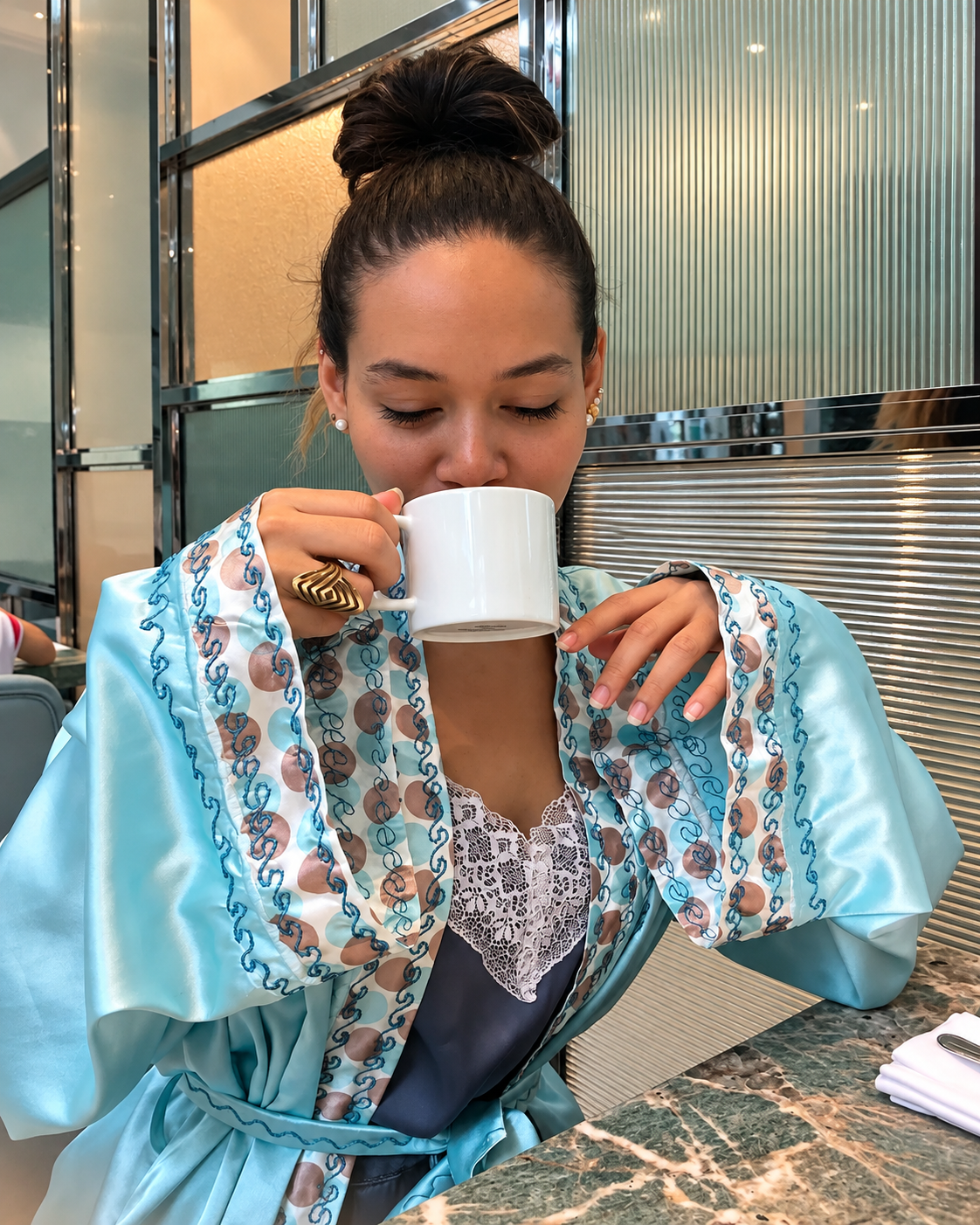
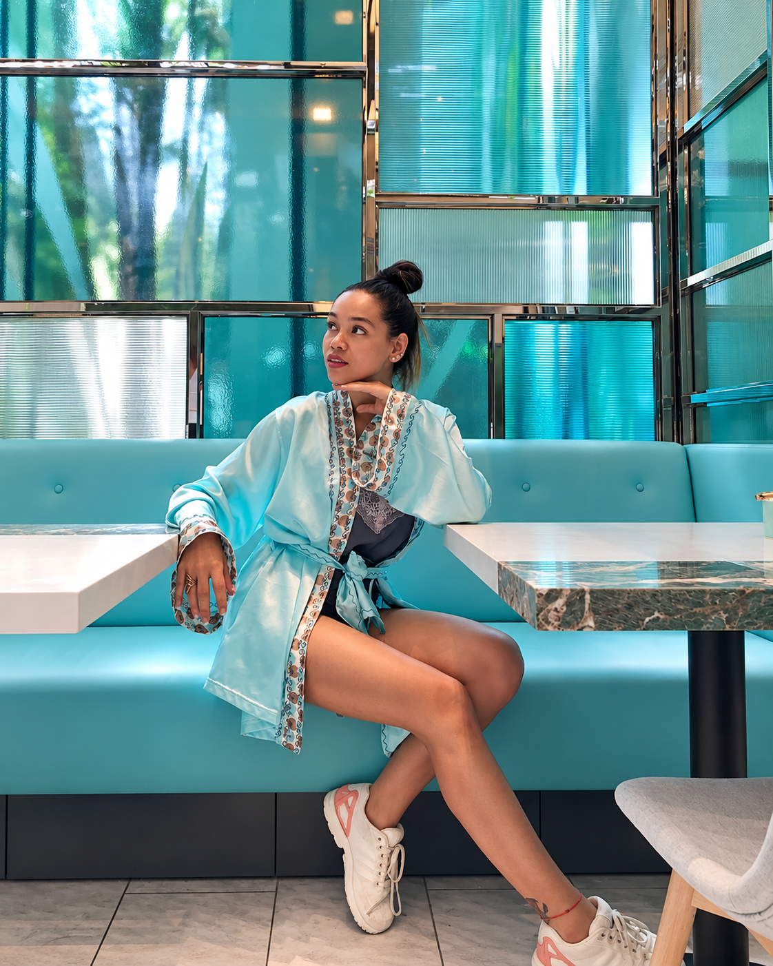
When Tiffany & Co. opened the Blue Box Café on the fourth floor of its New York flagship at 727 Fifth Avenue, it performed one of the most strategically coherent acts of experiential brand extension in the history of luxury retail: it gave Holly Golightly’s breakfast a physical address. The fantasy that the film’s opening sequence had planted in the imagination of every viewer since 1961 — the fantasy of actually, literally, having breakfast at Tiffany’s — was no longer a fantasy. It was a reservation. The cultural distance between watching Audrey Hepburn eat a croissant outside a jeweller’s window and sitting inside that jeweller’s, on blue upholstered chairs, eating off Tiffany china, surrounded by walls the colour of the boxes in the display cases below, had been closed by a café with forty seats and a seasonal American menu.
The commercial logic is elegant in its simplicity. Tiffany had possessed, for decades, one of the most powerful brand associations in popular culture. A consumer who could not afford Tiffany jewellery could not participate in that association through a purchase. The Blue Box Café created a lower barrier of entry to the Tiffany world — allowing a consumer to spend the price of a breakfast in the brand’s most significant location, in an environment saturated with Tiffany’s visual identity, in a room designed to make them feel that they were inside the box rather than merely looking at it from outside. The design decision that defines the space — the blue chairs, the blue-glazed china, the amazonite stone walls whose natural colour approximates Tiffany Blue, the herringbone marble floors — creates an immersion effect that no conventional retail environment can produce: the customer is not merely surrounded by the brand but temporarily constituted by it, existing for the duration of the meal inside the object that the brand has made its primary cultural symbol. The Blue Box Café is the most literal possible expression of what contemporary experiential retail aspires to be — and it is also among the most commercially astute acts of brand extension that the luxury sector has produced in its current generation. The most commercially consequential brand moves are always those that create genuine access to something the culture already desires rather than manufacturing new desire from scratch.
Experiential luxury retail refers to the deliberate transformation of physical commercial environments from transactional spaces — where the primary purpose is product display and purchase — into environments where the brand’s identity, values, and emotional associations are conveyed through spatial design, hospitality, programming, and sensory experience. The strategic logic is grounded in consumer psychology: emotional memories created through experience are more durable and more brand-specific than those created through product ownership alone, and experiences are more resistant to direct price comparison than products. The Blue Box Café represents one of the most analytically clear examples of experiential luxury retail in operation: it converts a pre-existing cultural desire — the fantasy of “having breakfast at Tiffany’s” created by the 1961 film — into a literal consumer experience at a lower price point than jewellery purchase, extending brand participation to consumers who may not be at a stage of purchasing Tiffany products but who are at a stage of forming brand associations that influence future purchasing behaviour. Other notable examples of experiential luxury retail include Gucci Osteria restaurants, Ralph’s Coffee locations, Louis Vuitton’s travelling café installations, and Hermès cultural programming. The category demonstrates the broader movement in luxury strategy from product-category ownership toward the creation of brand worlds that consumers can enter at multiple points and price levels.
The economics of recognition — why brand codes appreciate
The commercial logic underlying the Tiffany Blue Box’s value can be expressed as a simple proposition: a brand asset that can communicate meaning without language, across cultures, before a product is displayed or a name is read, is worth more than any equivalent asset that requires conscious decoding. Language-dependent brand communication — taglines, product descriptions, campaign copy — requires translation, cultural adaptation, and active cognitive engagement from the consumer. Visual codes operating at the level of conditioned perception require none of these. They work faster, more deeply, and across more contexts than any verbal equivalent. The Tiffany Blue Box communicates in the same instant to a consumer in New York, Tokyo, Paris, or Dubai, requiring no translation and no conscious effort on the receiver’s part. This is the specific commercial property that makes colour-level brand recognition so valuable — and so difficult to manufacture, sustain, or acquire.
The LVMH acquisition of Tiffany & Co. in January 2021 for approximately $15.8 billion — the largest transaction in the history of the luxury goods sector at the time of its completion — was in significant part a purchase of this accumulated recognition. The jewellery, the retail network, the manufacturing capabilities, the design archives — all of these have value in the conventional commercial sense. But the Tiffany Blue Box, and what it has come to mean in the collective perception of the global consumer market, may represent the most irreproducible element of what was acquired. A new luxury jewellery brand could spend fifty years and billions of dollars in marketing and not accumulate the cultural depth that Tiffany’s blue box carries from its hundred and fifty years of consistent application and emotional association. The irreproducibility of this kind of accumulated cultural meaning is what makes it, in the most rigorous commercial sense, a luxury asset in its own right — one that happens to be made of cardboard and paint. The most enduring luxury objects are those that carry accumulated human meaning beyond their material value — and the Tiffany Blue Box has accumulated more such meaning, across more occasions and more generations, than virtually any other commercial object in the luxury sector’s history.
Brand colour recognition refers to the ability of a consumer to identify a commercial entity through colour alone, without accompanying text, logo, or imagery. It represents one of the deepest forms of brand encoding available to commercial entities because it operates at the level of conditioned perception — the same psychological mechanism responsible for Pavlovian response — rather than at the level of conscious recognition. Research in colour psychology and brand perception consistently demonstrates that colour is the first visual attribute processed by the human eye and the most directly linked to emotional association and memory retrieval. A colour that achieves proprietary status in consumer perception — where that colour, in relevant commercial contexts, is consistently associated with a single brand — functions as a communication asset of extraordinary efficiency. Tiffany Blue (Pantone 1837) is among the most documented examples: consumer research across multiple markets demonstrates recognition rates that exceed those of many conventional logos, and the colour has achieved proprietary status in consumer perception in markets where Tiffany holds no trademark. The colour’s commercial value is inseparable from its consistency of application — the same shade on the same format of packaging, maintained without variation across a period now exceeding one hundred and fifty years.
The world the box built — when a jeweller becomes a cultural proposition
Tiffany & Co. was founded as a stationery and fancy goods emporium. It became one of the world’s great jewellers under the influence of Charles Tiffany’s commercial ambition and Louis Comfort Tiffany’s extraordinary artistic vision — the younger Tiffany’s stained glass work alone would have secured his place in the history of American decorative arts. The company’s expansion across the twentieth and twenty-first centuries into watches, fragrance, leather goods, home accessories, stationery, eyewear, and hospitality reflects a trajectory common to the most commercially successful luxury houses: the movement from product category to cultural proposition. The question every luxury brand faces at a certain level of cultural significance is whether to remain a product specialist or to become a world — and Tiffany’s answer, accelerated significantly under LVMH ownership, has been consistently to expand the world.
What makes Tiffany’s expansion particularly coherent — and what distinguishes it from the brand extensions that other luxury houses have pursued less successfully — is the visual coherence provided by the blue. Every category Tiffany enters, every retail environment it creates, every collaboration it pursues, can be immediately identified as Tiffany because the colour that has governed the brand’s identity for over a century and a half travels with it into every new territory. The home accessories collection is unmistakably Tiffany. The fragrance vending machine is unmistakably Tiffany. The café is unmistakably Tiffany. The visual code that began as a box colour has become the connective tissue of an entire brand world — ensuring that as Tiffany’s commercial footprint expands, its cultural coherence does not dilute. This is the specific commercial achievement that the Blue Box’s history makes possible: it gives the brand a visual language stable enough to govern expansion without constraint. The most culturally coherent luxury propositions are those in which a single governing idea — a colour, a form, a material — provides enough order to contain an expanding world without reducing it to monotony.

The future of the blue box — why recognisable codes become more valuable as environments become more saturated
The luxury market of the coming decades will be characterised by a paradox that Tiffany is better placed than most to navigate: as the number of luxury brands, luxury products, and luxury communications increases — accelerated by digital proliferation, AI-generated content, and the democratisation of luxury aesthetics through accessible platforms — the ability to be immediately recognised without effort will become rarer and therefore more valuable. In a world where beautiful imagery is effortlessly generated, where luxury aesthetics can be convincingly reproduced, and where the consumer’s attention is distributed across an increasing number of channels and stimuli, a colour that triggers brand recognition before the consumer has decided to look is among the most powerful assets a luxury house can possess.
Tiffany Blue was accumulated in a world where consistency was easier to maintain — fewer channels, fewer touchpoints, fewer competing claims on the consumer’s visual attention. Maintaining it in the current and future environment requires the same commitment to consistency but across a vastly more complex set of surfaces: digital campaigns, social content, physical retail, experiential installations, product collaborations, AI-generated imagery, virtual environments, and cultural placements in media that Tiffany does not control. The brands that succeed in maintaining colour-level recognition across this expanded landscape will have earned the most defensible position available in the contemporary luxury market. They will have achieved, in the digital age, what Tiffany achieved in the analogue one: a shade that means something before a name is read, a box that communicates before it is opened, a world that is recognisable before it is entered. The future of luxury may be increasingly screen-mediated. But the brands that survive culturally in that future will still need something that the human eye can identify, the human memory can retain, and the human heart can feel. For Tiffany, that thing happens to be blue.
“The box does not contain jewellery.
It contains meaning —
the accumulated weight
of every occasion it has arrived at,
every proposal it preceded,
every birthday it announced,
every Holly Golightly
who pressed her face to a Fifth Avenue window
and understood, without being told,
what the blue meant.
That is what a hundred and fifty years
of consistency produces.
Not packaging.
A language.”

